Image by Putnam & Putnam, courtesy Phaidon
.
If you have any comments, observations, or questions about what you read here, remember you can always Contact Me
All content included on this site such as text, graphics and images is protected by U.S and international copyright law.
The compilation of all content on this site is the exclusive property of the site copyright holder.
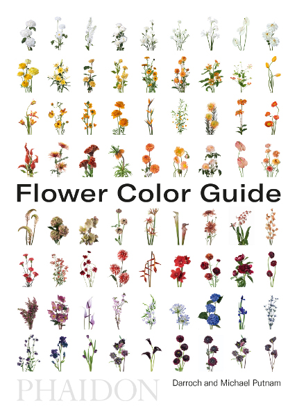
Flower Color Guide, a book review
Friday, 26 October 2018
Let me confess. I am more of the "stuff things in a vase and hope they don't fall over" school of flower arranging. The methods and techniques of those skilled in the art and craft of flower arranging are outside my area of expertise. But I am good with color. So when I read that there's a book that puts color at the center of the design process I was intrigued. Choose two flowers in two shades, say Putnam & Putnam, then create a transitional effect between them. Sounds easy, even for me.
Image by Putnam & Putnam, courtesy Phaidon
How did this book happen? Like this. Michael Putnam is a formally trained interior designer. Darroch Putnam is a photographer by trade. Michael began arranging flowers, for fun. Darroch photographed them. Pictures went up on Instagram. And, in a be still my heart moment, Vogue on-line wanted Michael to do something based on a Dutch still life painting. Then things took off. Their friends wanted arrangements. Then there were clients. It was learn by doing, questions the flower brokers on 28th Street. Putnam & Putnam learned, and wanted to share.
Which is how the book happened. Some publishers didn't get their approach. Phaidon did. Darroch had been photographing not only arrangements but also flower "portraits." With cut flowers flying in from around the world it did not make sense to take a seasonal approach. Flower Color Guide does it by color groupings. Once work began it was a matter of choosing which 400 or so images would be included, re-photographing as necessary. The hundred different varieties of flowers mean that roses, for example, appear with white, blush, pink, through red and lavender, and including tea and polyanthus roses.
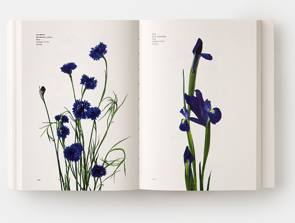
Image by Putnam & Putnam, courtesy Phaidon
All the expected color groupings to fill a rainbow - blue cornflower and Dutch iris
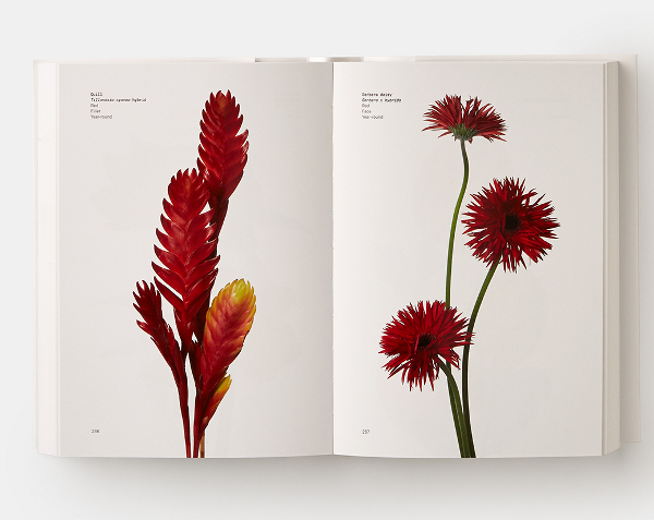
Image by Putnam & Putnam, courtesy Phaidon
vivid red gerbera daisy on the right and Tillandsia, a bromeliad, on the left.
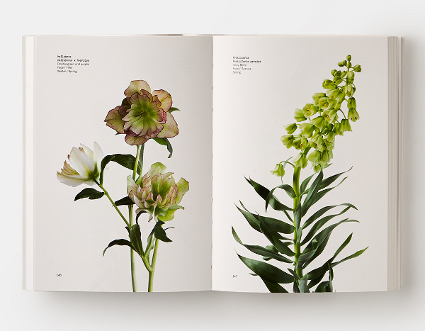
Image by Putnam & Putnam, courtesy Phaidon
There's even a section for green flowers, such as hellebore and fritillaria.
A modest 5 X 7 inches and 484 pages, the small format floral primer is a take along size, easy to hold in your hand, carry in a bag. One kind of flower per page, with a few lines of small text that give common name, Latin name, cultivar or color, placement in an arrangement such as filler, face, or texture, and seasonality. The appendices at the back of the book have a few pages with some simple, basic information - before you shop, basic flower care, suggested color palettes, etc. Left hand page for your notes, right hand page for text. But that's not all.
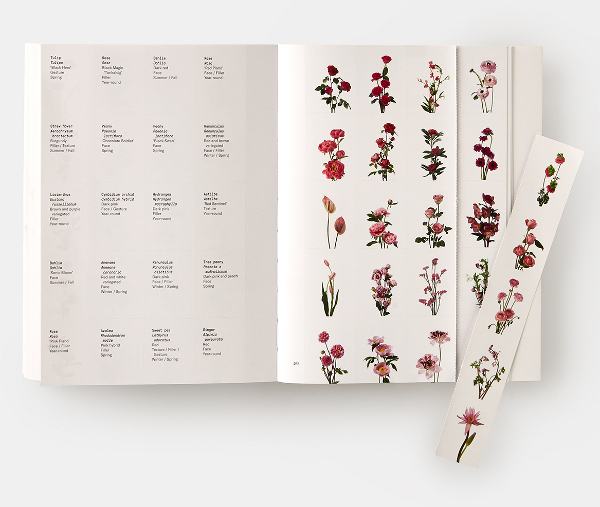
Image by Putnam & Putnam, courtesy Phaidon
The very back of the book has tear out flower chips for every image in the book
for use preparing mood boards, look books, and more, similar to Pantone chips.
Serendipitously, look what ever so timely turned up in my e-mailbox.
The New York Botanical Garden is hosting a Floral Design Showcase with Putnam & Putnam on October 26; from 10:00 a.m. to 11:30 a.m. in NYBG's Ross Hall. An unforgettable morning demonstration and talk with master floral designers Michael and Darroch Putnam, the authors of Flower Color Guide.
Described thusly: "With their densely layered, opulent arrangements, Darroch and Michael Putnam have become the toast of New York's fashion world and wedding scene. They count Bergdorf Goodman, Cartier, and Dior among their many A-list clients. To mark the publication of their new book, Flower Color Guide--a lavishly illustrated reference book, certain to become a go-to resource for seasoned designers as well as beginners--the Putnams will take the audience through their vision and process in a large-scale, in-depth floral demonstration on Friday, October 26, 2018, at The New York Botanical Garden, showing how they use color as their guiding principle. This rare demonstration will enchant and educate both practitioners and enthusiasts of cutting-edge floral design."
Reality pops up - will I, the uber casual, vase stuffing, flower arranger understand cutting-edge flower design? Aha! I ask my friend Sue Bunkin to join me. She is a master National Garden Club Judge, creates award wining arrangements for the Philadelphia flower show - she can be be my floral design whisperer. Off we go, Sue paging through Flower Color Guide, looking for suggestions for white flowers. Sue will be creating the bride's bouquet for her son's 'at home' family wedding before the destination wedding.
There wasn't any demonstration, actually. But interesting background discussion on how Putnam & Putnam came about. Michael began arranging flowers, for fun. Darroch photographed them. Pictures went up on Instagram. And, in a be still my heart moment, Vogue on-line wanted Michael to do something based on a Dutch still life painting.
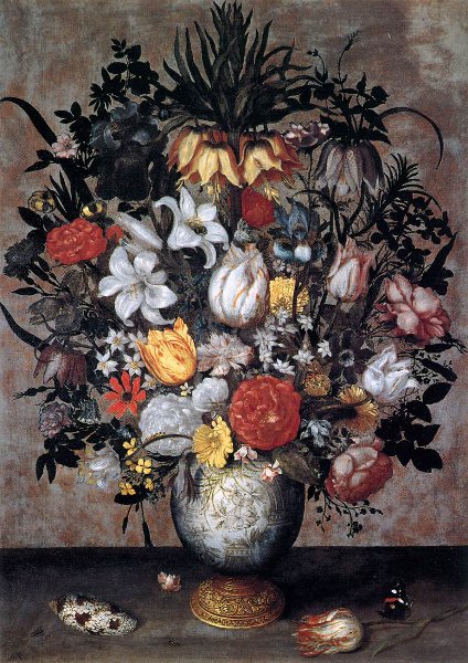
Ambrosius Bosschaert, Flowers in a Chinese Vase. Wiki Commons.
A different painting, but looking somewhat like this.
Flowers, from all seasons. The Dutch painters took months but today flowers come from around the world, all seasons, at any time. Fruit and foliage, vines and branches. Michael was creating stylish, elegant, lush bouquets for Vogue, Harper's Bazaar, Town & Country, Martha Stewart Living, many publications. Then editorial work. Weddings. Parties. Domestic. Abroad. Putnam and Putnam took off. Rather than working in their small apartment or out of the back of their Smart car (think very tiny) they now have both an atelier and separate office in Manhattan.
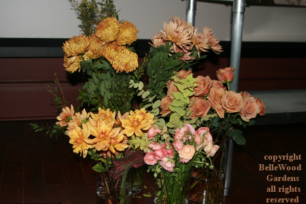
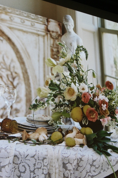
The stage was dressed with bunches of flowers, warm hues on the left
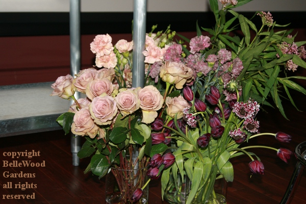
soft pinks and deep dark purples off to the right. Tulips, probably from
New Zealand. We're planting tulips now. They'd be flowering in the Antipodes.
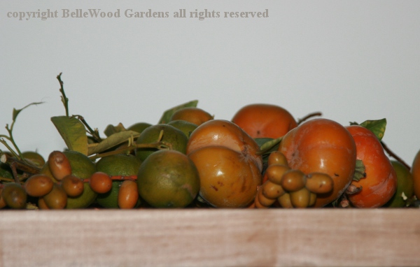
A platter of fruit. Persimmons, citrus, and what I think are clusters of palm fruits.
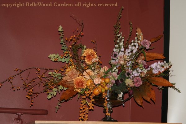
Michael had made an arrangement, before the program began. In the Q & A after the presentation someone asked, "How long did it take?" His answer, about 30 minutes. Bittersweet vines, trailing clusters of palm fruits, eucalyptus and autumn leaves accent the flowers. A bouquet with two distinctly different color palettes.
As we exit Ross Hall there's already an eager throng lining up to purchase copies of Flower Color Guide, then queueing up for autographs. Someone was buying three copies. Holiday shopping, Sue and I agreed. But then, as we were walking on the grounds to admire the spooky pumpkins what did we see
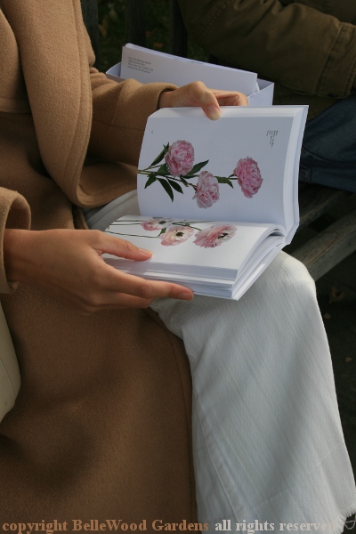
but someone happily perusing her copy of the book.
Published by Phaidon Press Limited, London and New York, NY
ISBN 978 0 7148 7755 6 (US), ISBN 978 0 7148 7830 0 (UK
soft cover, $35.00,
A review copy of this book was provided by the publisher.
Back to Top
Back to Book Reviews 2018
Back to October 2018
Back to the main Diary Page